# Installing Partner AddOns
{% hint style="info" %}
Visit our [Partner AddOn directory](https://docs.beefree.io/beefree-sdk/~/changes/480/builder-addons/partner-addons/partner-addons-directory) for a list of available and upcoming AddOns.
{% endhint %}
## Getting started
You can **use** ready-to-go AddOns to extend the functionality of Beefree SDK (you can also [build new AddOns](https://docs.beefree.io/beefree-sdk/~/changes/480/builder-addons/custom-addons)).
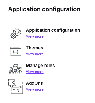
To browse and install existing AddOns, log into the [Beefree SDK Console](https://developers.beefree.io/) and click on *Details* to navigate to the application details page.
In the lower part of the page, locate the **Application configuration** section and click on AddOns.
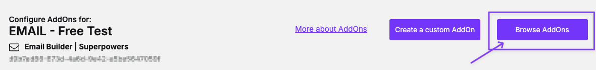
You will be taken to a page that lists the AddOns that have been installed for this application. If you are just getting started, the list will be empty.
Click on **Browse Partner AddOns** to get the list of ready-to-install AddOns. We call them **Partner AddOns** because they were developed by companies that partnered with us to extend Beefree SDK’s core functionality.
You will deal directly with those companies with regard to signing up for an account, cost, support, etc.
You will instead click on *Create a Custom AddOn* if you want to [build a new AddOn](https://docs.beefree.io/addon-development/) for Beefree SDK.
## Installing an AddOn
When you click on the **Browse Partner AddOns** button, a list of AddOns is displayed. You can browse them and select what you need to install.
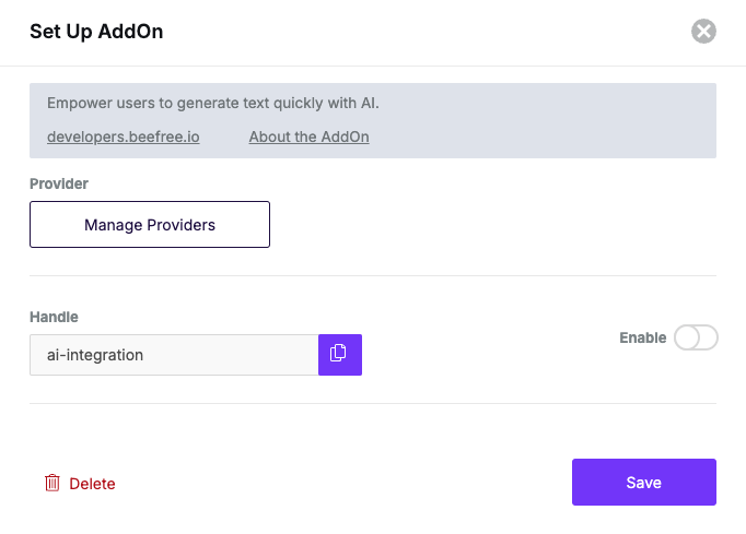
After installing a Partner AddOn, you will need to configure it by clicking on the **Edit** action. A form will be displayed.
At the top of the form you will find the AddOn name and some links to the AddOn documentation. If any signup is required, that is the company that you will need to contact.
Below that, you will see the following form fields:
* **API Key**\
Shown if this is an AddOn where a signup is required (you will be provided with an API key once you have signed up). Contact the provider of the AddOn if that is the case, so that you can learn about signing up, costs involved, the type of support they provide, etc.
* **Handle**\
A unique identifier for this AddOn. You will use this unique identifier to pass information to the AddOn from your application, if and when needed.
* **Enabled**\
A toggle element to enable and disable the AddOn. When toggled *OFF,* the AddOn is not visible to end users of the builder in your application.
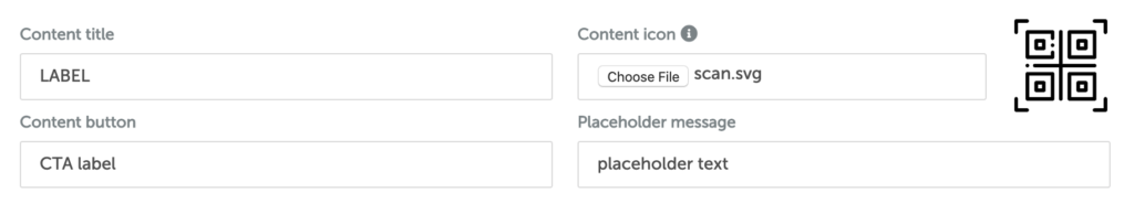
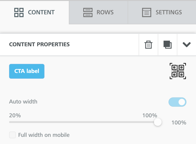
* **Icon**\
If you want to customize the icon associated with the *tile* shown in the builder *Content* tab, you canupload an image from your local PC. Choose an image that is small in size: we recommend a 64 x 64 pixel SVG file.
* **Labels**
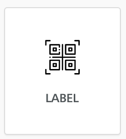
* Title: This is the name that will be used for the *tile* in the builder’s *Content* tab (e.g. “Countdown timer”).
* Call-to-action button: The label for the call-to-action button (e.g. “Select a Countdown Timer”), which is shown to end users on the button to configure the AddOn.
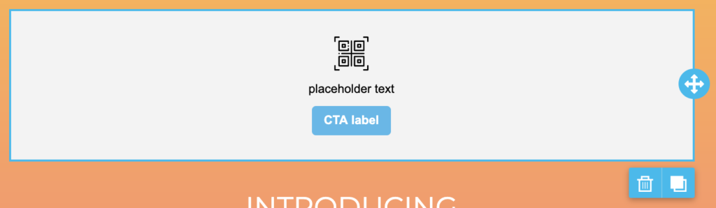
* Placeholder text: The message shown to end users in the builder stage when the tile is first dragged and dropped into it.
With the following setup…
… you would get the following outcome:
## **Title for the content tile**
## **Placeholder text and button**
It displays when the AddOn is added to the editing stage and invites the user to take the next step.
## **AddOn selection button in content properties**
When the AddOn content is selected, the same button is displayed in the content properties.
Visit our [AddOns Configuration](https://docs.beefree.io/beefree-sdk/~/changes/480/builder-addons/addons-configuration) to learn more about how to configure custom and partner addons.