# Passing forms to the builder
## Providing forms
You can load forms in the builder with two methods:
* by passing in the [configuration parameters](https://docs.beefree.io/beefree-sdk/~/changes/480/getting-started/readme/installation/configuration-parameters) a single, **default JSON form**, potentially including all the fields your application supports;
* by implementing a [content dialog](https://docs.beefree.io/beefree-sdk/~/changes/480/other-customizations/advanced-options/content-dialog) and building a user interface on top of the builder, so that your users can **browse and select forms**.
If you successfully implement either method, you’ll see a new Form content tile in the builder Content tab.
Let’s see in detail how these methods work.
## Default form in starting configuration
Use this method to provide a default form in the [configuration parameters](https://docs.beefree.io/beefree-sdk/~/changes/480/getting-started/readme/installation/configuration-parameters) when the builder starts.
```javascript
defaultForm: {
// Form
},
```
The default form will load when the user drags the form tile from the “Content” tab into the stage.
Here is an example of a typical login form:
```javascript
defaultForm: {
structure: {
title: 'Form title',
fields: {
email: {type: 'email', label: 'Email'},
password: {type: 'password', label: 'Password'},
submit: {type: 'submit', label: ' ', attributes: {value: 'Login'}},
},
layout: [
['email', 'password', 'submit']
]
}
},
```
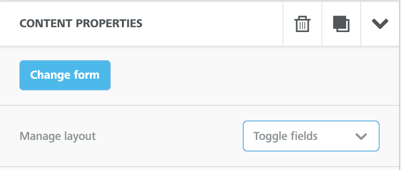
The default form you pass to a Beefree SDK application may consist of a simple form (e.g., the most used one), or a longer form that the user can customize using the options in the form content properties, as pictured here:
The flexibility of these properties allows you to cover multiple form building capabilities, even when implementing just a default form. Let’s see how.
For higher flexibility and better user experience, the form can be customized with the optional `canBeModified`, `canBeRemovedFromLayout`, and `removeFromLayout` attributes.
### Disable editing for a field
| Attribute | Applies to | Type | Default value |
| --------------- | -------------------------------------------------------------------------------------------------------------------------------------------- | ------- | ------------- |
| `canBeModified` |
all fields except file, hidden, label, and submit, since they cannot be edited
| boolean | true |
This attribute can be used to turn off the “Edit field” dialog for a field. If set to false, the configuration for that field will be locked to the one defined in the form JSON you passed to the application, except for the label.
If unspecified, it will be applied as true, allowing the user to edit the field using the builder UI.
### Indicate when a field can be toggled off
| Attribute | Applies to | Type | Default value |
| ------------------------ | ---------- | ------- | ------------- |
| `canBeRemovedFromLayout` | all fields | boolean | true |
This attribute indicates that a field can be toggled off by the user. If unspecified, it will be applied as true, allowing the user to switch it on or off in the builder UI.
It’s a best practice to add `canBeRemovedFromLayout: false` to mandatory fields (e.g., the email address field in a sign-up form) so that they can’t be excluded in the HTML form.
### Toggle off a field when loading a form
| Attribute | Applies to | Type | Default value |
| ------------------ | ---------- | ------- | ------------- |
| `removeFromLayout` | all fields | boolean | false |
This attribute indicates that a field is toggled off by default when the form is loaded. This behavior is quite useful to simplify the first experience when working with forms:
1. you can use a single form with all the possible fields, so there is no form selection step;
2. you can hide less common fields to load the most used combination at first, and keep the starting point simple, or even empty;
3. the user than can explore available fields with the form properites and build their custom form
#### Here is an example:
```javascript
defaultForm: {
"structure": {
"fields": {
"name": {
"type": "text",
"label": "Name",
"removeFromLayout": true,
"canBeRemovedFromLayout": true
},
"surname": {
"type": "text",
"label": "Surname",
"removeFromLayout": true,
"canBeRemovedFromLayout": true,
},
"email": {
"type": "email",
"label": "Email *",
"canBeRemovedFromLayout": false,
"attributes": {
"required": true
}
},
"notes": {
"type": "textarea",
"label": "Notes",
"removeFromLayout": true,
"canBeRemovedFromLayout": true
},
"privacy": {
"type": "checkbox",
"label": "Accept privacy policy. [Read it here](http://example.com)",
"canBeModified": false,
"canBeRemovedFromLayout": false,
"attributes": {
"required": true
}
},
"submit_button": {
"type": "submit",
"label": "",
"canBeRemovedFromLayout": false,
"attributes": {
"value": "SEND DATA",
"name": "submit_button"
}
}
}
}
},
```
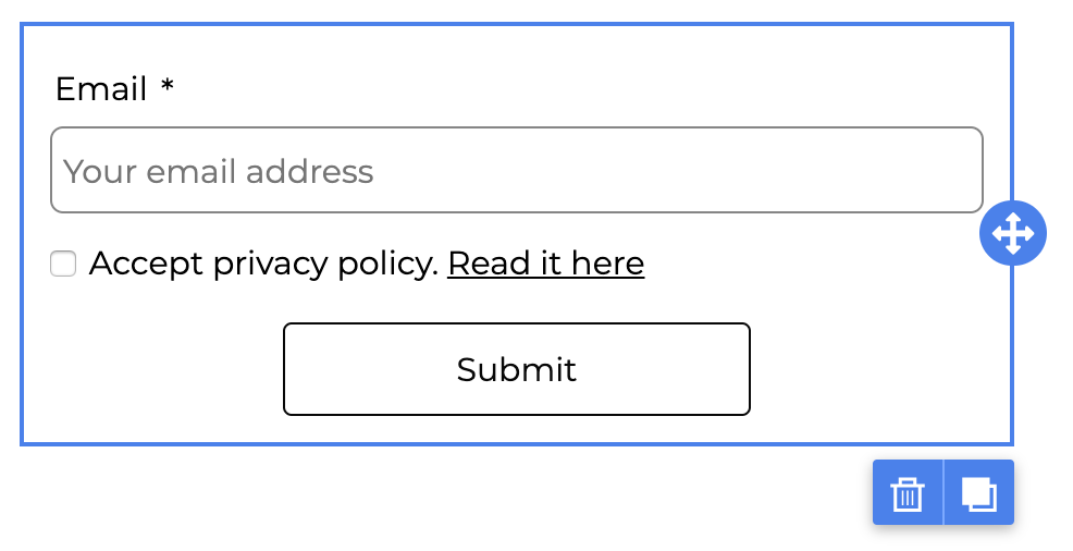
When added, the form shows the minimum fields for submtting an email, e.g. for subscribing to a newsletter:
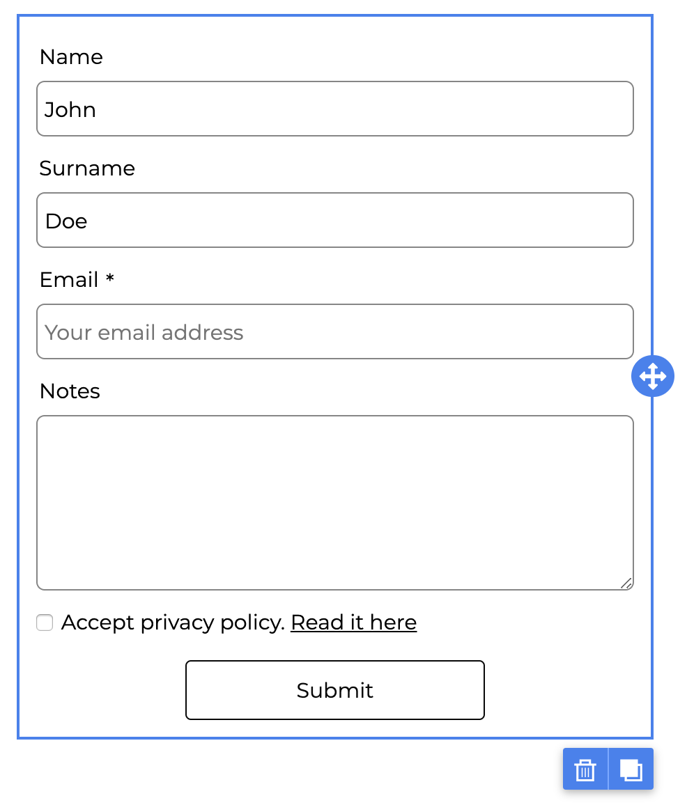
but then, the user can toggle on the available fields to transform it:
## Implementing a content dialog
{% hint style="info" %}
The Content Dialog feature is available on Beefree SDK [paid plans](https://developers.beefree.io/pricing-plans) only.
{% endhint %}
The content dialog allows you to build a user interface for selecting a form, on top of the builder. It can be a simple list with prebuilt forms, a search through categorized forms, a small form configurator or wizard, or even a complete form builder tailored for your application’s data.
For detailed information about this feature, please check the content dialog section.
The object that defines the form content dialog is the following:
```javascript
manageForm: {
label: 'Change form',
handler: async (resolve, reject, args) => {
// Your function
}
},
```
As with most content dialog objects, the label is used within the interface to trigger the function:
The resolve object in the handler function must return a form using the structure and parameters described in [this section](https://docs.beefree.io/beefree-sdk/~/changes/480/forms/integrating-and-using-the-form-block/form-structure-and-parameters).
The args object in the handler function returns to the host application the form object already applied. With this information, the application can decide what to display to the user (e.g., edit the current form, suggest a similar form, etc.).
An example of the content dialog object in beeConfig that handles special links and forms:
```javascript
contentDialog: {
specialLinks: {
label: 'Custom text for links',
handler: function(resolve, reject) {
openMySpecialLinkDialog() // Replace this with your application function
.then(specialLink => resolve(specialLink))
.catch(() => reject())
}
},
manageForm: {
label: 'Edit form',
handler: async (resolve, reject, args) => {
const structure = await onHandleManageForm(args)
structure ? resolve(structure) : reject()
}
},
},
```
.png?alt=media&token=8f5cc59e-76cc-4165-8098-89662e867a32)