> For the complete documentation index, see [llms.txt](https://docs.beefree.io/end-user-guide/llms.txt). Markdown versions of documentation pages are available by appending `.md` to page URLs; this page is available as [Markdown](https://docs.beefree.io/end-user-guide/content-blocks/icons.md).
# Icons
## Overview
The addition of the icon content block in the builder has made it more convenient to use text and images together, offering a cohesive way to enhance your designs. Icons serve as small, expressive elements that can accentuate your content, making the layout more interactive and visually appealing. Icons can replace or accompany traditional bullet points for a more visually compelling list.
## How to Use Icons
To start incorporating icons into your project, follow these steps:
1. **Drag an Icon Block:** Drag an icon content block into the row where you'd like the icon to appear. A placeholder icon will initially fill the block.
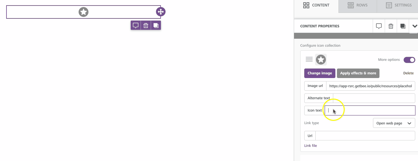
2. **Access Icon Options:** Click on the placeholder to open the icon customization options in the sidebar.
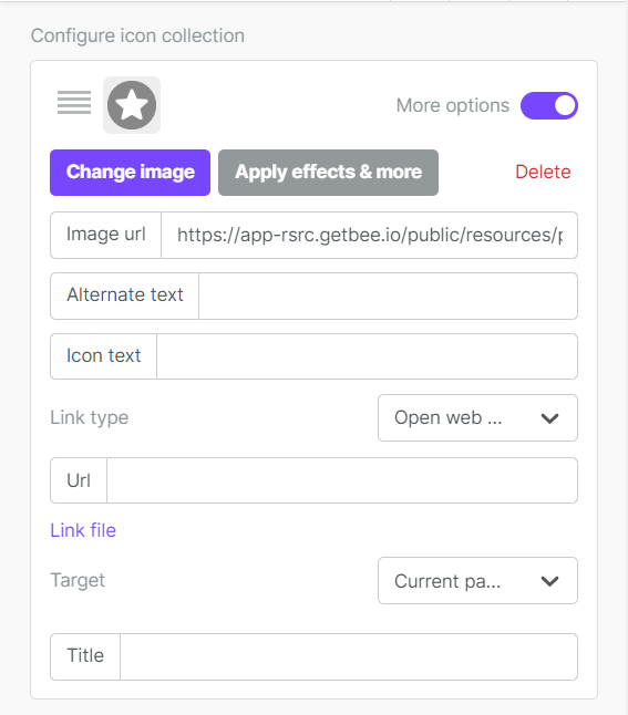
3. **Add or Replace Icon:** Click 'Add new icon' to insert a pre-loaded icon into the builder stage. Alternatively, you can change the existing icon by clicking the 'Change image' button, which will open your file manager.
4. **Image Editing:** Should you need to modify your icon, the 'Apply effects & more' option allows access to an image editor.
5. **Additional Settings:** Under 'More options', you'll find settings that are unique to the icon content block, like icon text and positioning options.
## Customizing Icon Properties
You can customize the following icon properties:
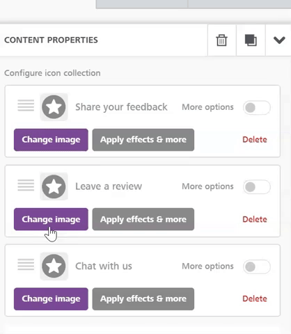
* **Icon Text:** Entering text into the 'Icon text' field will add a text label near the icon. A new field in the sidebar will appear, giving you the option to adjust this text.
* **Text Position:** You can specify where the text should appear relative to the icon—above, below, or to the sides—using the 'text position' dropdown menu.
* **Reorder Icons:** If you've included multiple icons, you can easily rearrange their order by clicking and dragging them.
* **Icon Size and Spacing:** Two specific settings allow you to resize the icons and set the space between them.
* **Additional Settings:** These are standard settings you'll find in other content blocks, like padding, border, alignment, etc., and apply to the entire content block.
---
# Agent Instructions
This documentation is published with GitBook. GitBook is the documentation platform designed so that both humans and AI agents can read, navigate, and reason over technical content effectively. Learn more at gitbook.com.
## Querying This Documentation
If you need additional information that is not directly available in this page, you can query the documentation dynamically by asking a question.
Perform an HTTP GET request on the current page URL with the `ask` query parameter, and the optional `goal` query parameter:
```
GET https://docs.beefree.io/end-user-guide/content-blocks/icons.md?ask=&goal=
```
`ask` is the immediate question: it should be specific, self-contained, and written in natural language.
`goal` is optional and describes the broader end goal you are ultimately trying to accomplish on behalf of the user. GitBook uses it to tailor the answer towards what is most useful for that goal.
The response will contain a direct answer to the question and relevant excerpts and sources from the documentation.
Use this mechanism when the answer is not explicitly present in the current page, you need clarification or additional context, or you want to retrieve related documentation sections.