> For the complete documentation index, see [llms.txt](https://docs.beefree.io/end-user-guide/llms.txt). Markdown versions of documentation pages are available by appending `.md` to page URLs; this page is available as [Markdown](https://docs.beefree.io/end-user-guide/design-tools/mobile-optimization-options.md).
# Mobile Optimization Options
#### Overview
The importance of mobile-friendly designs can't be overstated. While the builder's default settings aim for universal usability by automatically stacking columns on mobile devices, you may want to fine-tune this behavior. This section outlines the features designed to optimize the mobile responsiveness of your emails and landing pages.
#### Desktop vs. Mobile Preview
The default vertical stacking is widely supported. However, some email clients that lack CSS support will default to the desktop layout.
#### Customizable Mobile Behavior
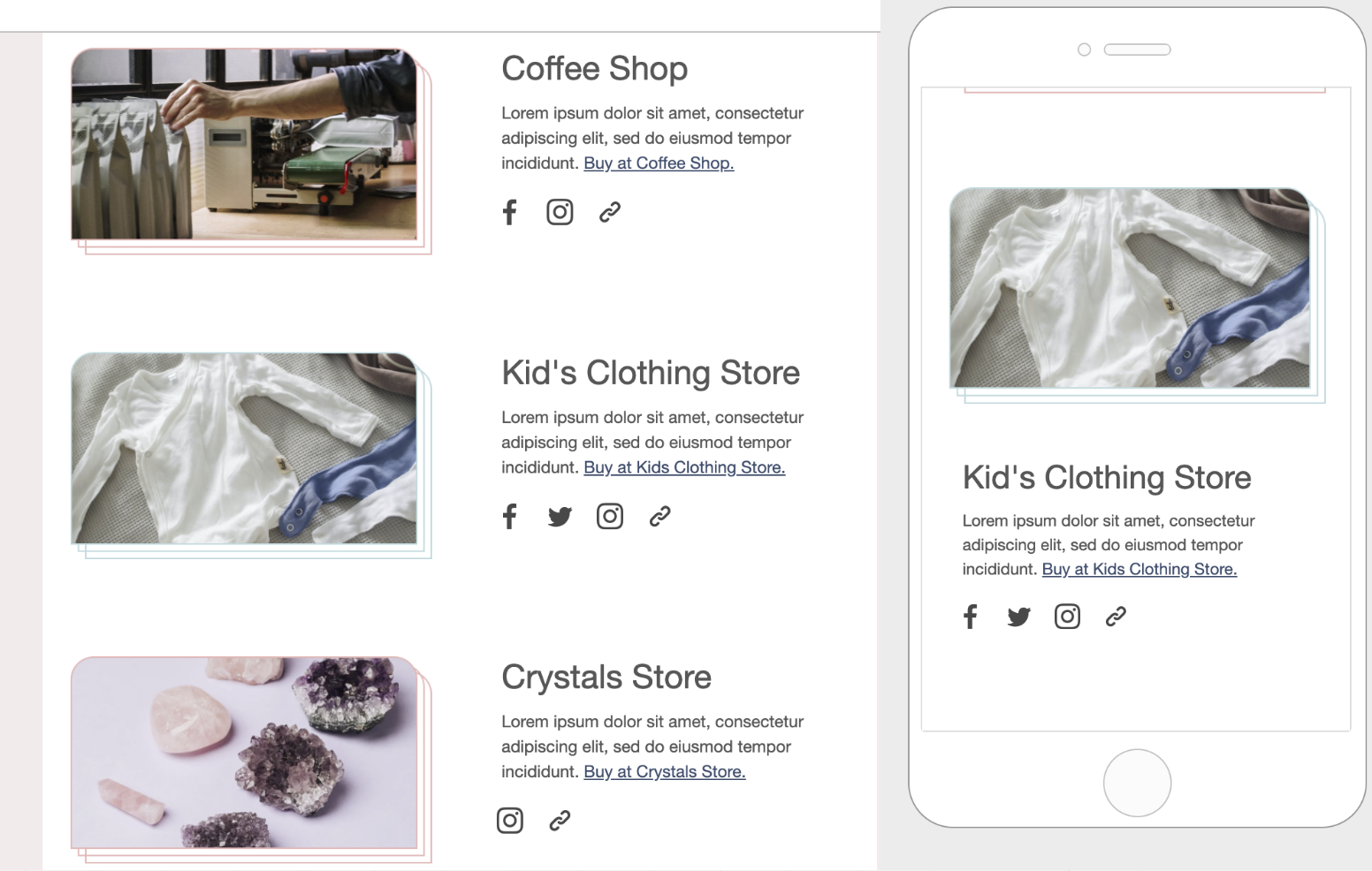
Do Not Stack on Mobile:
* This row property prevents the default column stacking.
* Located in the sidebar, toggled off by default.
{% embed url="" %}
Reverse Stack on Mobile:
* Reverses the stacking order of columns in mobile view.
{% embed url="" %}
#### Mobile Styles
* Offers granular customization like text size and padding.
* Available only in mobile design mode.
{% embed url="" %}
#### Special Considerations
Not every design benefits from the default mobile settings. Vertical stacking may distort navigation bars or other unique design elements. Therefore, always preview and test your design across different devices to ensure optimal user experience.
#### Best Practices
Although the builder offers options to override default behaviors, it's generally recommended to allow vertical stacking for a more mobile-friendly layout. Nevertheless, the final decision rests on your design requirements and creativity.
---
# Agent Instructions
This documentation is published with GitBook. GitBook is the documentation platform designed so that both humans and AI agents can read, navigate, and reason over technical content effectively. Learn more at gitbook.com.
## Querying This Documentation
If you need additional information that is not directly available in this page, you can query the documentation dynamically by asking a question.
Perform an HTTP GET request on the current page URL with the `ask` query parameter, and the optional `goal` query parameter:
```
GET https://docs.beefree.io/end-user-guide/design-tools/mobile-optimization-options.md?ask=&goal=
```
`ask` is the immediate question: it should be specific, self-contained, and written in natural language.
`goal` is optional and describes the broader end goal you are ultimately trying to accomplish on behalf of the user. GitBook uses it to tailor the answer towards what is most useful for that goal.
The response will contain a direct answer to the question and relevant excerpts and sources from the documentation.
Use this mechanism when the answer is not explicitly present in the current page, you need clarification or additional context, or you want to retrieve related documentation sections.