> For the complete documentation index, see [llms.txt](https://docs.beefree.io/end-user-guide/llms.txt). Markdown versions of documentation pages are available by appending `.md` to page URLs; this page is available as [Markdown](https://docs.beefree.io/end-user-guide/design-tools/padding.md).
# Padding
#### Overview
Padding serves as an essential tool for refining the aesthetics and readability of your design. The builder provides various padding options that can be customized for both rows and individual content blocks.
#### Default Padding Features
By default, you can set the padding around an element for all sides simultaneously.
To do so:
1. Select the element.
2. Use the padding options in the sidebar.
For a more nuanced approach, toggle on 'More options' to apply padding to each side individually.
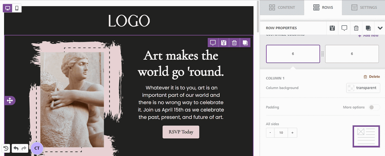
#### Padding in Rows
Column Level Padding:
* Locate 'Customize Columns' at the bottom of the sidebar after selecting a row.
* Apply padding here to impact the entire column within the row.
Consistency vs. Uniqueness:
* For multi-column rows, consistent padding across all columns is generally advised.
* However, individual padding settings can be applied to each column for a more varied look.
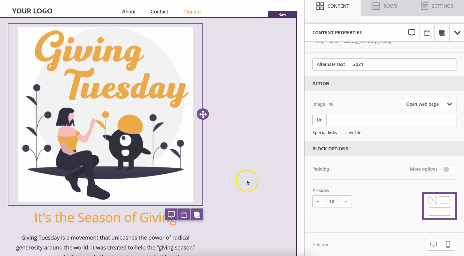
#### Padding in Content Blocks
General Padding:
* For most content blocks (except spacers), padding options are under 'Block options' in the sidebar.
* These settings affect the entire content block.
#### Special Cases: Content Blocks with Unique Padding Options
Buttons:
* Allows for content padding specific to the text inside the button.
* Useful for customizing button dimensions or text positioning.
Icons:
* Offers padding options only for the icon images within the block.
* Icons can combine both text and images in a single block
Menus:
* Provides padding options specifically between each menu item.
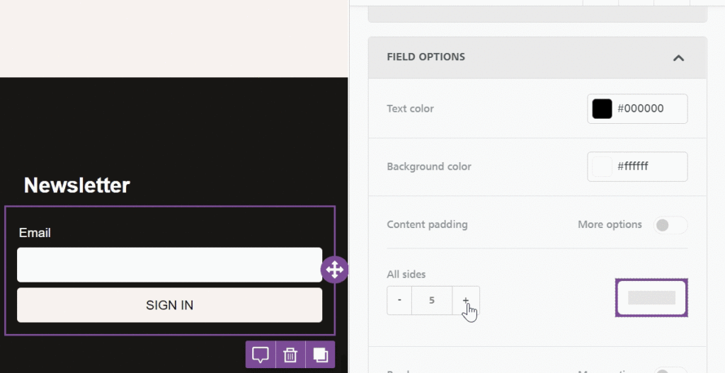
Forms:
* Only available in the Page builder.
* Allows for two additional padding options:
* 'Field options' for text fields that can be filled out.
* 'Button options,' similar to button padding for forms.
---
# Agent Instructions
This documentation is published with GitBook. GitBook is the documentation platform designed so that both humans and AI agents can read, navigate, and reason over technical content effectively. Learn more at gitbook.com.
## Querying This Documentation
If you need additional information that is not directly available in this page, you can query the documentation dynamically by asking a question.
Perform an HTTP GET request on the current page URL with the `ask` query parameter, and the optional `goal` query parameter:
```
GET https://docs.beefree.io/end-user-guide/design-tools/padding.md?ask=&goal=
```
`ask` is the immediate question: it should be specific, self-contained, and written in natural language.
`goal` is optional and describes the broader end goal you are ultimately trying to accomplish on behalf of the user. GitBook uses it to tailor the answer towards what is most useful for that goal.
The response will contain a direct answer to the question and relevant excerpts and sources from the documentation.
Use this mechanism when the answer is not explicitly present in the current page, you need clarification or additional context, or you want to retrieve related documentation sections.